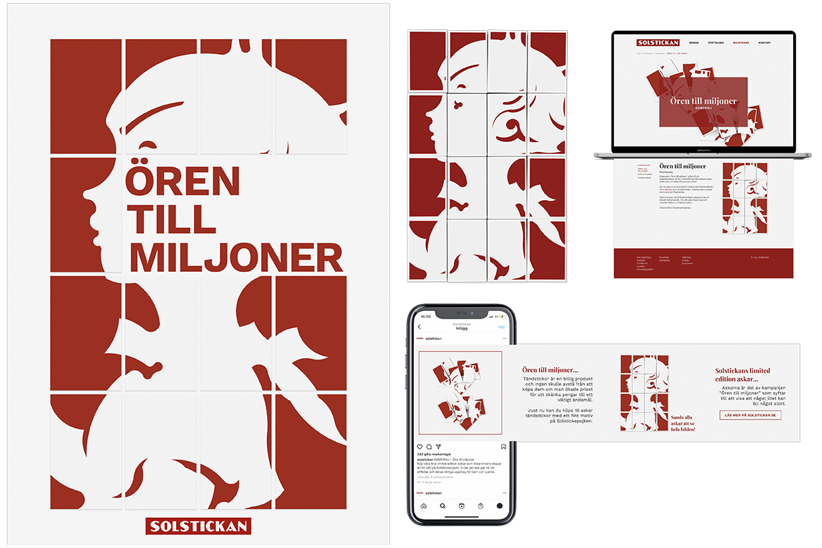
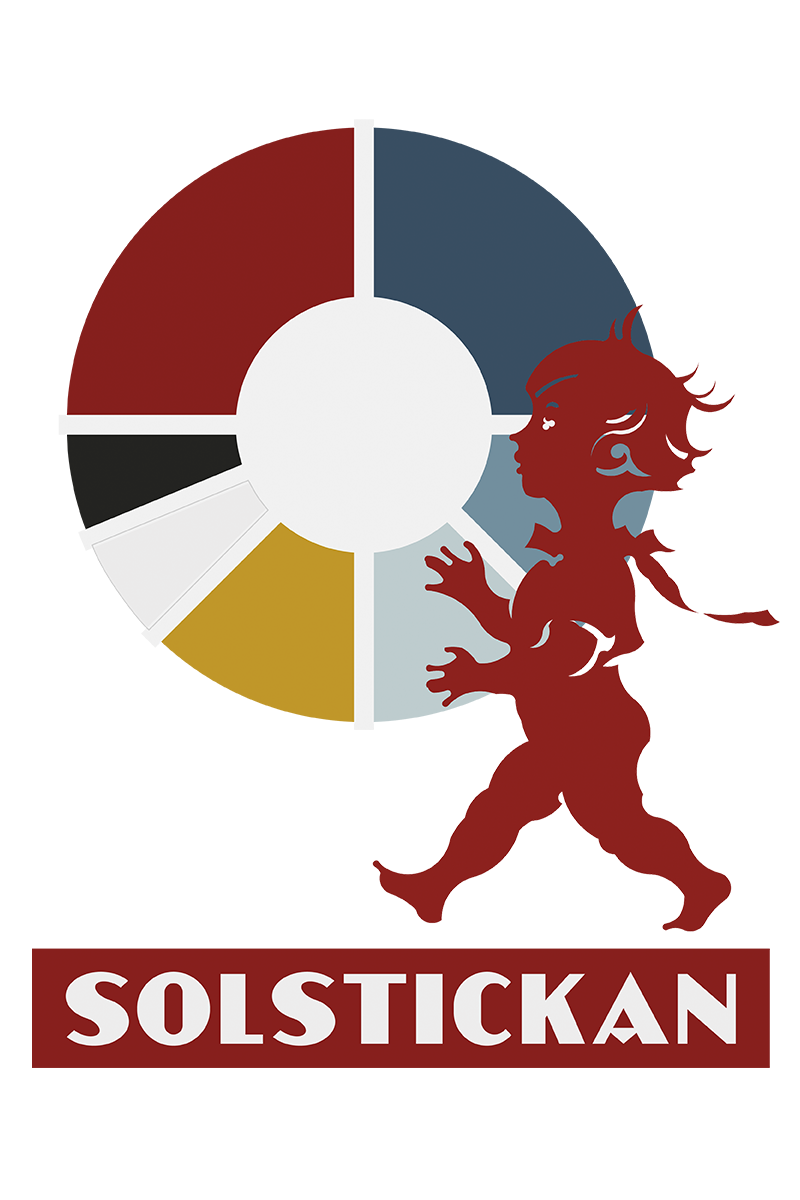
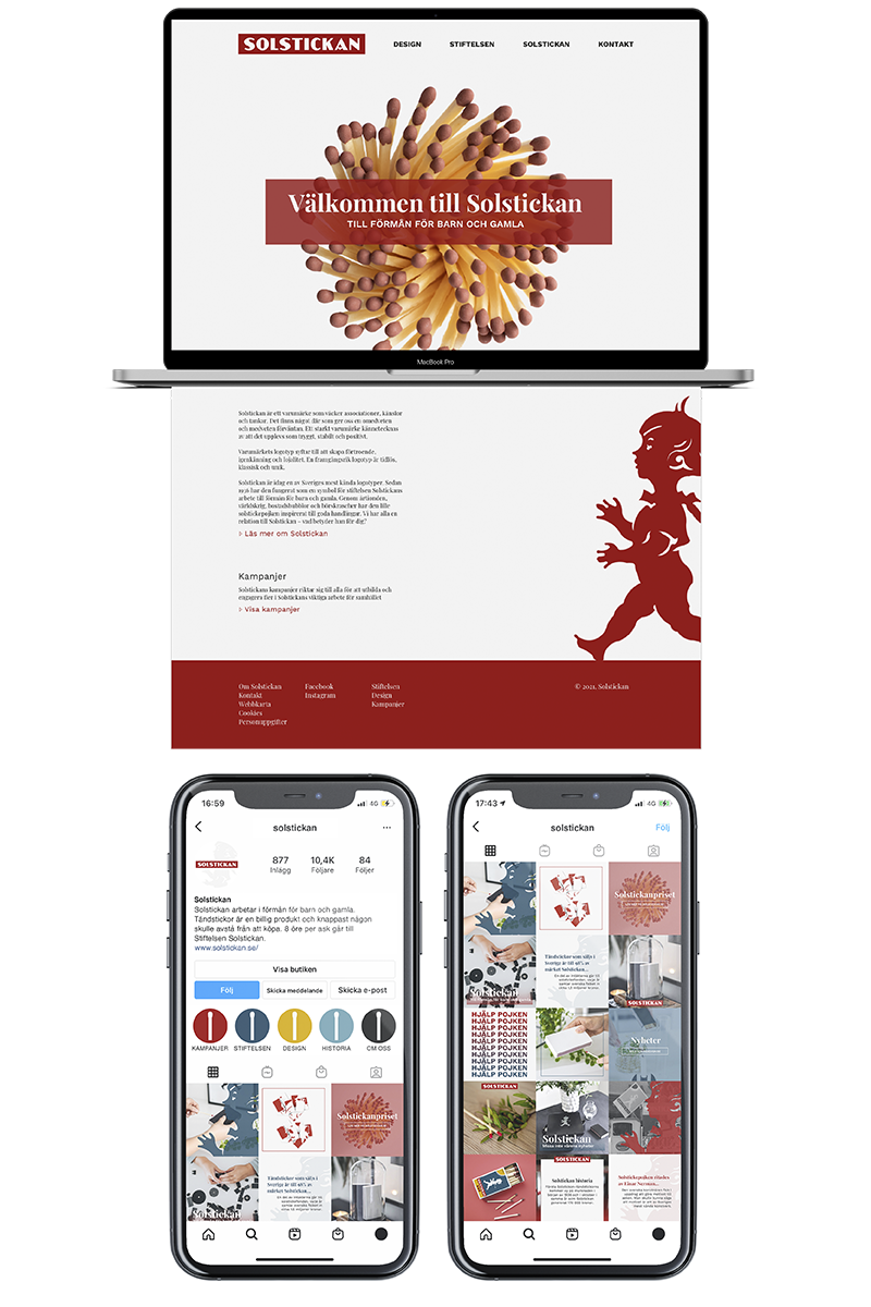
Facelift for the boy in everyone’s home
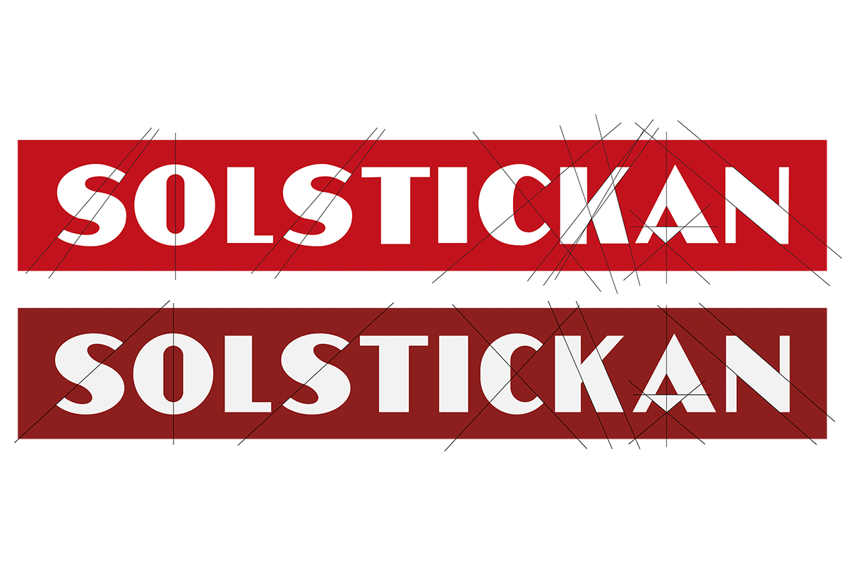
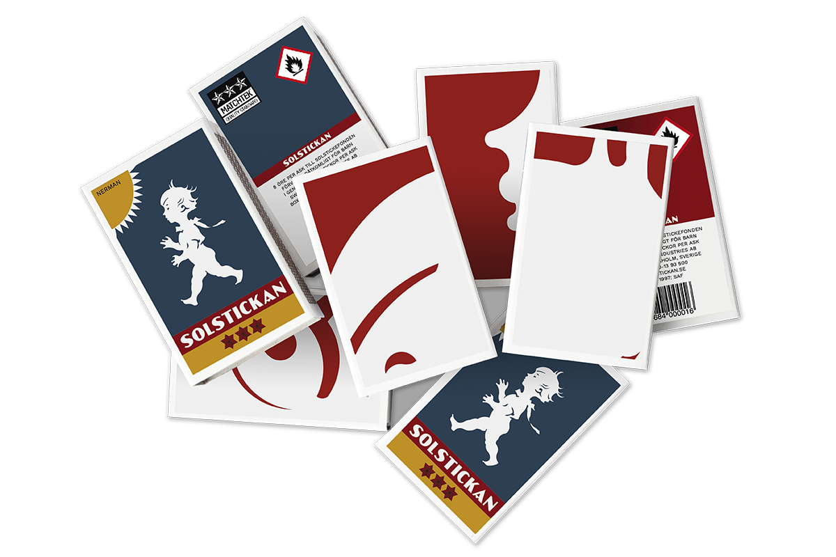
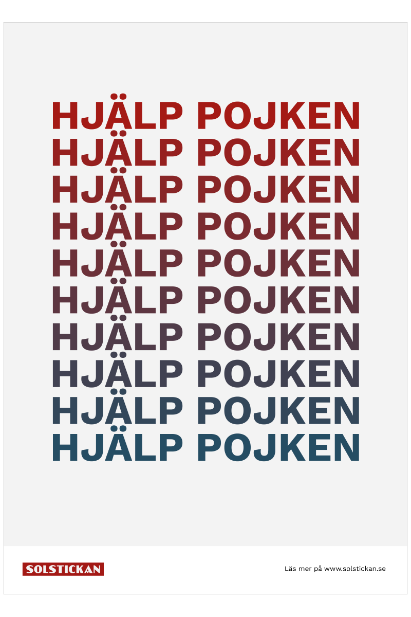
My design project is about a well-known Swedish company who is in a huge need for a facelift and to transfer them from 1936 into 2021. Solstickan is the go-to brand for matches in Sweden, and they have a strong graphic profile. By updating both colors and their logotype I managed to give Solstickan a more modern look. At the same time, new campaigns and more use of digital platforms were created to spread the company's message to more people in society. Many people may know about Solstickan, but not their values, which is why I thought it was about time they expanded their graphic profile to fit a more modern society.