IF IT AIN’T BROKE, DON’T FIX IT
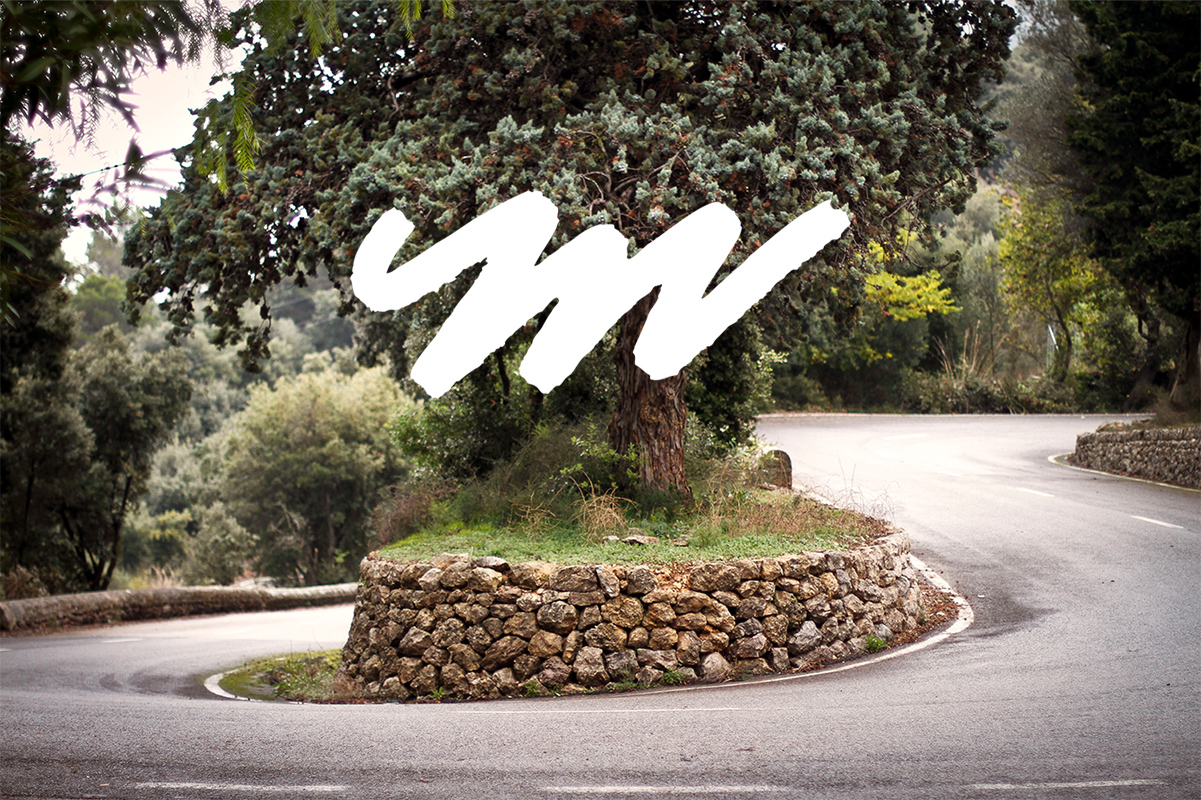
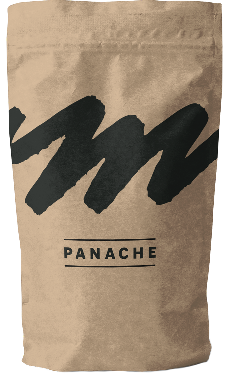
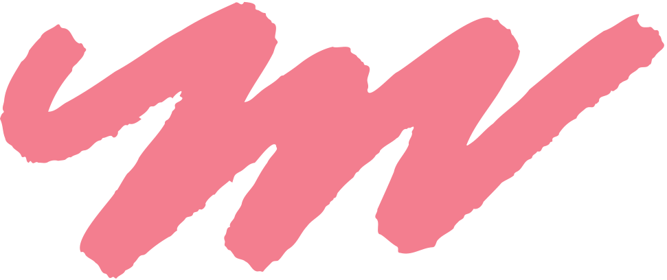
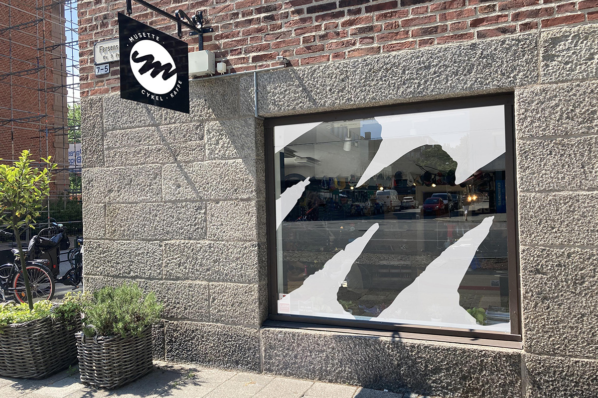
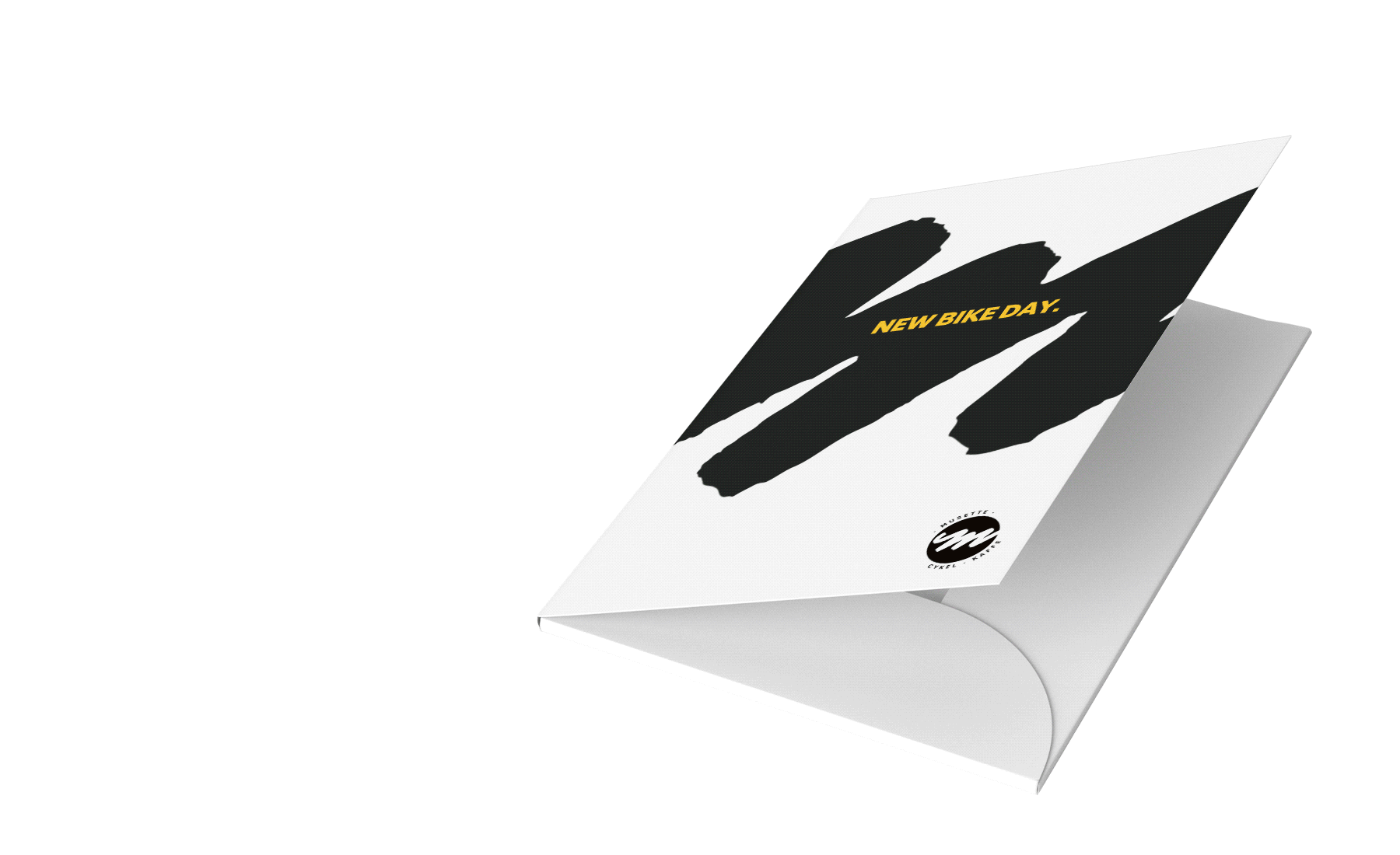
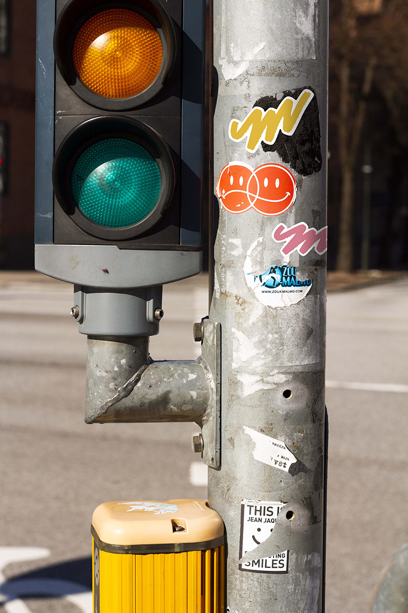
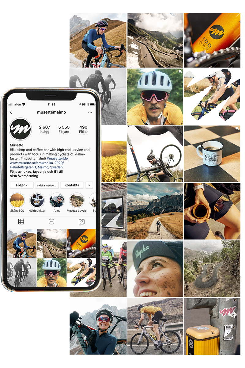
Why not make something evolve before it has to be “fixed”. My design project is a re-branding of the Malmö-based bicycle shop Musette. The brand’s graphic profile and communication is not broken, but I have updated it to more clearly convey what Musette is and wants to be. The re-branding is based on analyzing competitors, the brand today and a survey with the shareholders. Based on that, I created a brighter, happier and more welcoming profile with a clear image style. A challenge through the project has been to find the right level of change for the brand. I therefore initially worked on the basis of three tracks: revision, evolution and revolution. The re-branding landed in an evolution despite the fact that typography, image style, logo, symbol and colors changed. The re-branding aimed to show that Musette is developing and hasn’t stagnated in its form. I have added two colors to the palette and defined the yellow signature color, the black and white. Pink was added as a complement to the yellow, with the same clear connection to cycling, Giro d’Italia’s leader jersey. A dark green tone was added as a connection to the forest and mountain bike. Musette's logo was rebuilt into a symbol, the M, which retains a lot of recognition but makes the connection to a road / path / mountain even clearer. The M is easy to apply and has been given many forms to be as flexible as possible but still retain its basic shape.